


Digital Dilemma
Or, How to Stop Yelling at Clouds

Digital comics are here. They’ve been here. They’re not going away in your lifetime. So, how do you not just “deal with it” but actually cater to it and the readers that follow?
Well, this Comicbook Creation post has old, incapable, digitally-inept people like you in mind! (I’m kidding, of course. Mostly.) Let’s dive in on how you can capitalize on Digital Comics and the market that’s storming your doors (whether you realize it or not) as a Creator!

Let’s Get Digital! Digital!

When digital comics first hit many of us thought it wouldn’t work out. Comics have always been printed, right? On paper! These tablets and phones and laptops and TVs (yes, TVs) aren’t suitable places for reading comics. It’s just not gonna work!
Heh.
Comixology was founded in 2007. Since that time there have been literally dozens of upstart digital comic reader platforms. I’ve used DriveThruComics.com for almost two decades (yes, it’s actually 2 yrs older than Comixology) to sell my digital books. There’s Comix.one, IndyPlanet, CBZ Reader, Crunchyroll, Webtoon, Tapas, Viz Media, Manga Plus, Hoopla, and on and on. That’s ignoring that Marvel, DC, IDW, and several other publishers have also introduced their own branded readers & library apps over the years (with varying success). And yes, sure, some of those are manga-specific but that says nothing to the point: digital comics1 are here to stay.
I Got It, Charlie, Thank You. Now What…?
Well, let’s talk about how to go about doing this for your best performance. If you’re not doing this to make it your best effort then why are you doing anything at all? Right, so let’s make it our best.
Some debate the “value” of making books that will sell. IDGAF where you are on that debate — the point here works for both the Master-of-Puppets Capitalist and the Give-It-All-Away Socialist. You make comics that you want people to read. Hopefully enjoy. Because you enjoyed making it! Great. Me, too, so let’s talk about making your final output something that can be properly enjoyed by your readers and fandom. Because ultimately, no matter how hard you work, no matter how much you invest (financially, emotionally, physically, socially, etc.) the readers only see the final product. Whether you’re selling it or not, it’s a product. An output of effort.
Let’s give them the best goddamn output possible. They deserve it. Your product deserves it. You deserve it.
If you read my previous post you know I’m passionate about getting my works into readers’ hands in the best way I can.

Well, if you followed the steps I outlined in that post you’re more than 90% there! Because you already constructed the PDF file for print, you just need to make that PDF into a digitally-consumable one that doesn’t look like ass when you’re finished.
Can’t I Just Take JPEGs & Make Them Into A PDF or CBZ?
FOR THE LOVE OF ALL THINGS DO NOT USE A GD JPEG FOR YOUR FINAL OUTPUT!!!!!!
Same goes for PNG, TIF, or any other graphics format. Make a PDF. Stop being stubborn!
No, seriously. STOP.
It’s fine if your final, colored art is a JPEG. Not the best for printing, but if the resolution is high enough (300dpi+ at full size) you can make it work, but not if the JPEG also includes your lettered layers!
“Charlie, what you mean?”
Lettered layers should never ever be rasterized into bits. If you don’t know the difference between rasters (pixels) and vectors (objects2) just know this: your lettered layers should never be made into a pixelated format (“rasters” such as JPEGs, PNGs, TIFs, BMPs, etc.). I’m using absolutes here which someone once scolded me over (“Charlie, you’re being authoritative like your way is the only way…” not even kidding), but I’m dead-f*ckin’ serious:
Please. Do. Not. Rasterize3. Your. Lettering.
Instead, place your letters in a layer above the art (your letterer usually does this for you — you did hire a professional letterer, right…?) and create a PDF of the final pages. Again, refer to my previous article if you’re curious about that part. Once you have your final PDF for the printer, it’s a few simple steps to make that same PDF into a perfectly-viable and wonderfully viewable/readable PDF for digital consumption.
On that note, if you’re going back to the original file in your graphic design or publisher tool, then I recommend flattening as many layers as possible (leaving only the lettered layer and artwork layer intact) and delete any stray objects that aren’t a part of your final product (such as logos, design elements, and other ephemera laying outside of your artboards for use — I know I’m not the only one who drops all kinds of shit outside the artboards like a junk drawer. You can’t fool me…).
Step One (of Thirty)
After you’ve saved your print-ready PDF, keep it open and do a quick color check using Acrobat or a free online tool.4 Now, for me, I usually go back to the original file build I did in Illustrator or Affinity Designer (or InDesign or Affinity Publisher, if that’s your jam) and convert the original build into an RGB colorspace and change the Color Profile, but I’m giving you the fastest & best option without redoing all of that work.5
Once you’ve converted the file from CMYK to RGB, do yourself a favor and flip through every page for a quick review that nothing got borken.6 Assuming everything is g2g7 then you can begin the save process all over again.
If you’re using Adobe, it will likely yell at you to save the file again before proceeding. It’s annoying AF, but whatever. Save it with a new file name (do not save over your print-ready file! NoooOOoOoooOoOoOooOoooOOoo!!! Okay, yeh, I’ve done this…)
After that secondary, unnecessary Save, go to File > Save As Other… > Optimized PDF
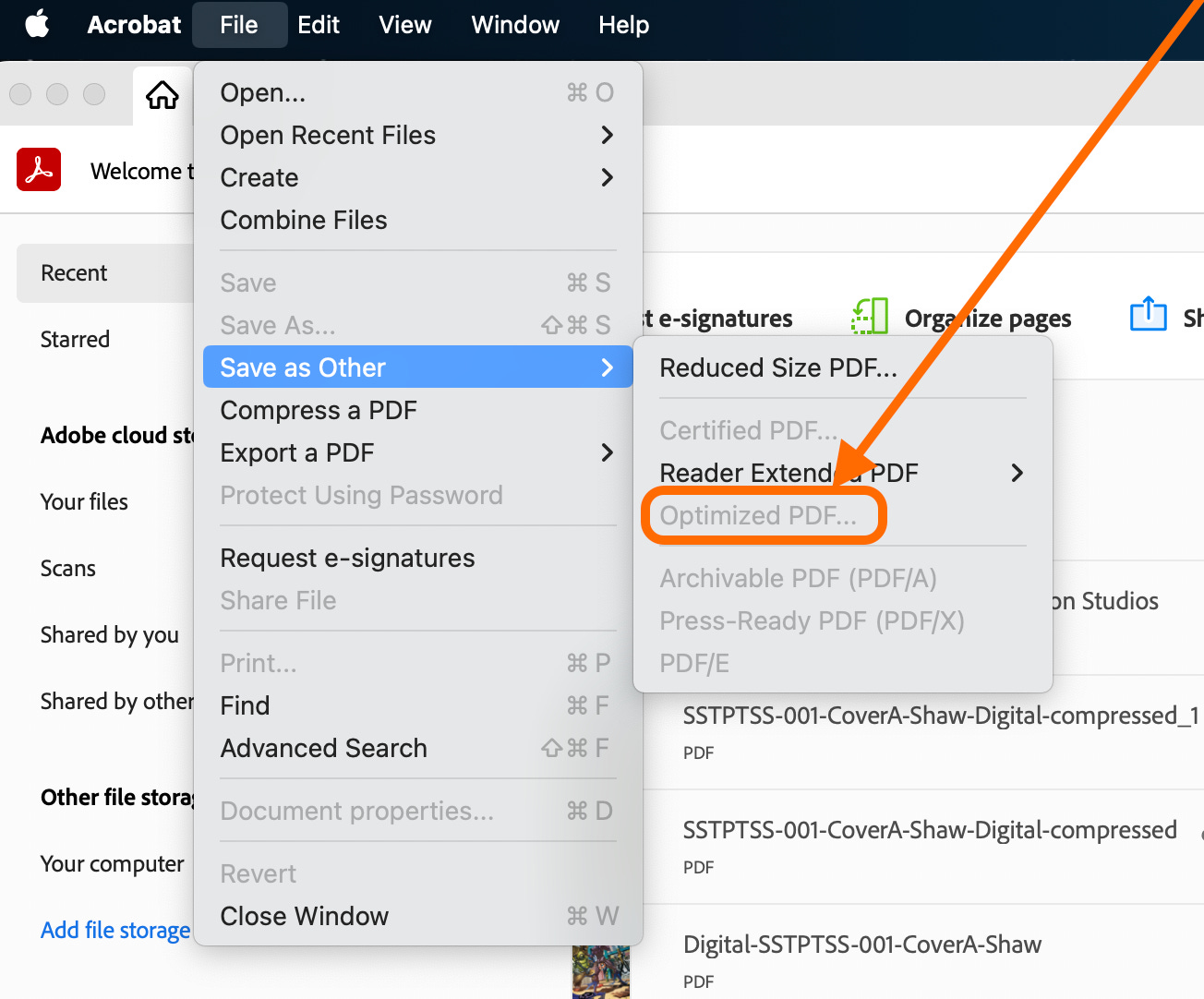
It’s tempting to wanna choose Compress a PDF or Reduced Sized PDF… but these are temptations you should most definitely avoid if your goal is to make pretty digital comics. I’m not going to go into why in this post because it’s already long enough. Find me on social media and we can discuss it.
Here are the settings I use for this digital export:
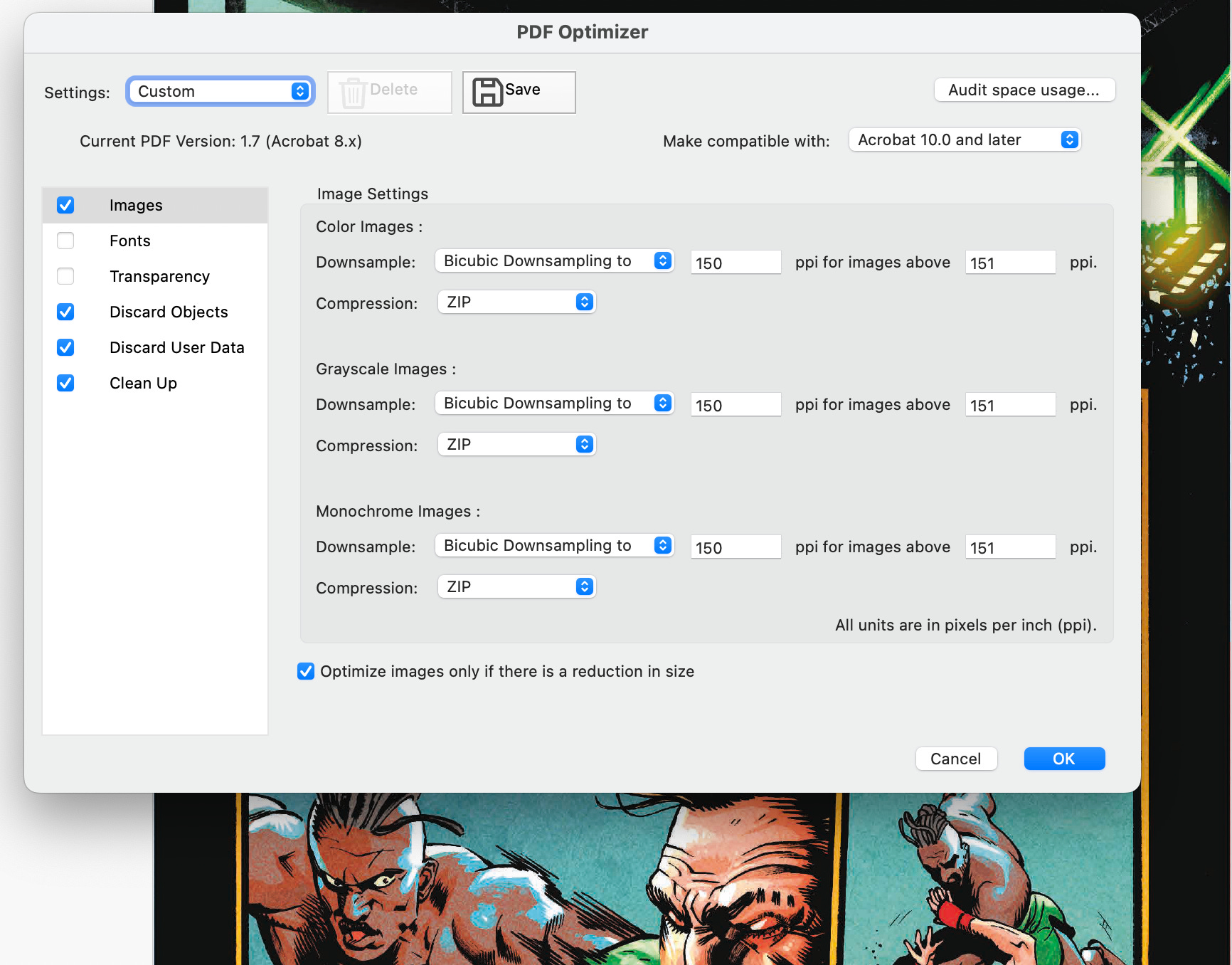


Do not embed fonts. Do not use any transparency. These both add significantly to your final file size when saved. You shouldn’t have any fonts that aren’t converted to objects anyway, so leaving this checked is doubly-dubious at this stage in the game.
Save it with a tag or something to make it easier for you to note that this is a digital comic, intended for digital consumption. What you call it is your business, LOL.
That’s it! Now you have a print-ready file and a digital-ready file for your comic!
Seems Like a Lot Of Work. Why Should I Bother?
Glad you asked!
A picture, they say, is worth a thousand words. Here’s two:


Notice the difference?? Same word balloon, same book, best quality output but the JPEG looks like pixellated garbage compared to the PDF! Whoah!
Now, imagine your whole book looking like that when someone zooms in on their tablet or phone. You get the idea.
And to take it a step further, this is the max zoom I could do on my laptop for that same text (I just zoomed in on the word “PORTALS” as much as it would let me):

So, hopefully that was helpful!
I post these because I give a shit about indiecomics and I really, really wanna see us all get better. Have your own tips? Drop them in the comments! Be helpful, not a dick.
My best to you all!
~Charlie~
If you don’t think manga and comics are the same thing just from different cultures and using slightly varied formats, then we can have a separate conversation at a con some day. It’ll be short, because I’m right. 😎
Actually, mathematical computation points, but that’s more detail than we need methinks.
Pixelate, choose your language. Same result: turning your vector letters into pixellated images. Blech.
Especially if you’re paying someone else to do your prepress work. Although the truly best option is to re-export your pages into a new PDF using the RGB colorspace for this digital output, honestly. Still, the way I outline above is a simpler, and yet still highest-quality way to go about things.
Not a typo, nerds. 🤓🤓🤓
“good to go”… do try to keep up, folks 😜
I think parts of this accidentally got repeated multiple times.