


Killvin & Stabs
Or, I Died Laughing While My Wife Married Yet Another Man


Okay, I’m going to admit something: I f*ckin’ loved this book and wish it was 20 pages longer. I love the Johnny the Homicidal Maniac homage cover (so I backed at that level), and I love the general concept. It’s really entertaining.

So, here’s my review of IFTKP #1 (unsure if we’re getting a #2, but hopefully we do).
The Gist
IFTKP starts out at a funeral scene, or a memorial scene — whatever. It’s in a graveyard, so WGAF. The point is, this sets us up for a quick intro and then dives into the initial sequence.
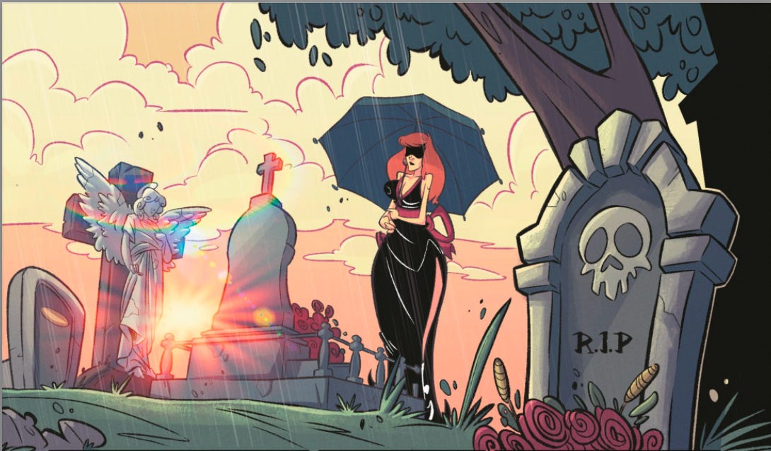
Somber to start, the glass is shattered almost immediately.

And thus, we already know our characters. This is exceptional character-building on display. It takes us exactly one page to figure out this woman is a serial widow (hmm…) and the boy is both intelligent and cunning AF. Okay, time to buckle up it seems.
From the original Kickstarter page:
Tommy’s mom is a serial killer.
Tommy’s dad is a serial killer.
He’s not very well-adjusted.
It's Fun To Kill People is a 24 page dark comedy written by [Anthony Stokes'], illustrated by Marco Leone, colored By Fabi Marques and Barlo Moreira, and lettered by Stephen Kok.
It's Fun To Kill People is like Calvin and Hobbes mixed with Johnny The Homicidal Maniac. It has vignette style storytelling that is a callback to classic cartoons. It is bold and irreverent in a way that is perfect for Kickstarter.
Reviewing the Coroner’s Report
IFTKP is a funny romp through a dysfunctional mother-son duo as well as a revisit of a sh*tty childhood dealing with middle school bullies and exacting revenge on these same a$$holes.
The book is nicely paced with moments framed like vignettes, and my only gripe is it was too short!
Marco Leone’s art is an incredibly perfect complement to Stokes’s script. The zany, dark psychosis is brought to life perfectly with a Watterson-esque touch to the line work. The fun and frolic of Calvin & Hobbes is captured in murderous intent here. It’s absolutely spot-f*ckin’-on.
Fabi (I love Fabi — she’s a dope colorist and an even doper human) and Barlo paint a vivid, Saturday Morning palette that evokes both freshness and nostalgia.
Es Kay’s letters are professional and a rarity amongst indies (I see so many bad lettering jobs in indiecomics and it’s completely unnecessary), but I have some quibbles with their SFX lettering choices. These feel very generic and uninteresting. SFX should bring a sense of depth to the book in a way that adds character and “audible texture” but also doesn’t distract the reader. I’m a designer by education so please recognize I’m a sh*tload harsher on lettering than I am most other parts of a comic (aside from writing, which I’ll get to next).
Full disclosure: I am friends with Stokes and I’ve hired him to work with me as a collaborator and co-writer on American Yakuza.
Stokes’s script is solid. Probably his second-best script that’s not a Xion Studios publication. Intrusive Thoughts is my personal favorite of his, but I’m also here for the psychological thrillers. The humor is dark and well-timed. The pacing is great, though I feel like it could’ve used a few more pages to stretch out some of the moments and improve the timing. A minor quibble for an otherwise fantastic comicbook. It’s a satisfyingly sardonic ride through a sh*tty family dynamic and a really f*cked up childhood. I love it.
I really hope Stokes blesses us with a second issue, and we discussed this on a Twitter/X Spaces recently, but he remains mum on confirming a follow-up. I recommend you go read this initial issue and see for yourself just how much fun this crazy-ass book is — and then tell Stokes to make more!

Rating the Faces of Death
Okay, like my dawg Chef Reactions I gotta break this down to a review. Obviously, I tried this book already, so there’s that.. and I’d eat a whole plate of this one.

